
Machine Learning: Ordinary least squares using statsmodel api
Regression: Building a predictive model
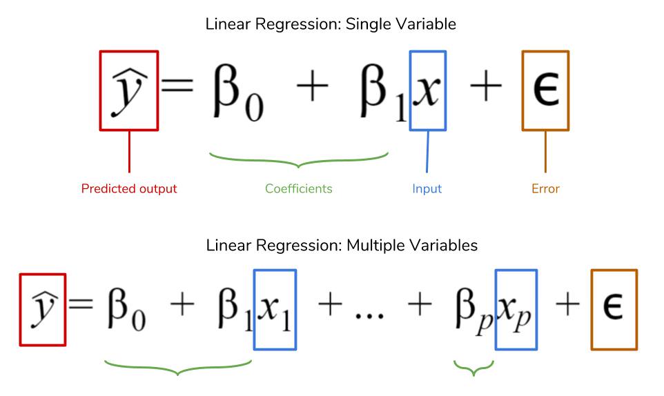
Linear regression or the ordinary least sqaures method, is a supervised machine learning technique that is used to predict a continuos valued output. Everytime we fit a multiple linear regression model to our data, we compute a set of weights or coefficients, $\beta_0,\beta_1,\beta_2, \beta_3…\beta_n$ where $\beta_0$ is the intercept or the constant plus a bias term also called the error term $\epsilon$.
In this post, I will show you how to build a predictive model using the statsmodel api. Before we get into that, let’s talk about the data we will be using. There are two datasets that will be used for this predictive model i.e. County health rankings and in particular the Years of potential life lost (YPPL) and Additional measures data of which you can find the cleaned up versions on my github.
Years of potential life lost or YPPL is an estimate of the average years a person would have lived if he or she had not died prematurely. It is, therefore, a measure of premature mortality. As an alternative to death rates, it is a method that gives more weight to deaths that occur among younger people.
To calculate the years of potential life lost or YPPL, an upper reference age is determined. The reference age should correspond roughly to the life expectancy of the population under study. In this data, the reference age is 75. So if a person dies at 65, their YPPL is calculated as: 75 - 65 = 10 and so on.
Now, let’s get into the data. First step of any data science project is to clean the data. This may include handling missing values if any, normalizing our data, perfoming One Hot encoding for categorical variables etc. Machine learning models do not work if our data have missing values so it’s very important that we check for missing values.
python code block to import data analysis packages:
# import data analysis libraries
import pandas as pd
import numpy as np

# import plotting library matplotlib
import matplotlib.pyplot as plt


# import ols from sklearn / predictive modeling
from statsmodels.api import OLS

# turn off future warnings
import warnings
warnings.filterwarnings(action='ignore')


# normalising packages
from sklearn.preprocessing import MinMaxScaler, StandardScaler, RobustScaler, MaxAbsScaler
ypll = pd.read_csv('ypll.csv') # load data
ypll.head() # view first 5 rows
| FIPS | State | County | Unreliable | YPLL Rate | |
|---|---|---|---|---|---|
| 0 | 1000 | Alabama | NaN | NaN | 10189.0 |
| 1 | 1001 | Alabama | Autauga | NaN | 9967.0 |
| 2 | 1003 | Alabama | Baldwin | NaN | 8322.0 |
| 3 | 1005 | Alabama | Barbour | NaN | 9559.0 |
| 4 | 1007 | Alabama | Bibb | NaN | 13283.0 |
add_measures = pd.read_csv('additional_measures_cleaned.csv') # import and load data
add_measures.head() # view first 5 rows
| FIPS | State | County | Population | < 18 | 65 and over | African American | Female | Rural | %Diabetes | HIV rate | Physical Inactivity | mental health provider rate | median household income | % high housing costs | % Free lunch | % child Illiteracy | % Drive Alone | |
|---|---|---|---|---|---|---|---|---|---|---|---|---|---|---|---|---|---|---|
| 0 | 1000 | Alabama | NaN | 4708708 | 23.9 | 13.8 | 26.1 | 51.6 | 44.6 | 12 | NaN | 31 | 20 | 42586.0 | 30 | 51.0 | 14.8 | 84 |
| 1 | 1001 | Alabama | Autauga | 50756 | 27.8 | 11.6 | 18.4 | 51.4 | 44.8 | 11 | 170.0 | 33 | 2 | 51622.0 | 25 | 29.0 | 12.7 | 86 |
| 2 | 1003 | Alabama | Baldwin | 179878 | 23.1 | 17.0 | 10.0 | 51.0 | 54.2 | 10 | 176.0 | 25 | 17 | 51957.0 | 29 | 29.0 | 10.6 | 83 |
| 3 | 1005 | Alabama | Barbour | 29737 | 22.3 | 13.8 | 46.6 | 46.8 | 71.5 | 14 | 331.0 | 35 | 7 | 30896.0 | 36 | 65.0 | 23.2 | 82 |
| 4 | 1007 | Alabama | Bibb | 21587 | 23.3 | 13.5 | 22.3 | 48.0 | 81.5 | 11 | 90.0 | 37 | 0 | 41076.0 | 18 | 48.0 | 17.5 | 83 |
ypll.info() # check dataset information
<class 'pandas.core.frame.DataFrame'>
RangeIndex: 3192 entries, 0 to 3191
Data columns (total 5 columns):
FIPS          3192 non-null int64
State         3192 non-null object
County        3141 non-null object
Unreliable    196 non-null object
YPLL Rate     3097 non-null float64
dtypes: float64(1), int64(1), object(3)
memory usage: 124.8+ KB
# drop countries where data was deemed unreliable, marked by x
ypll.drop(index=ypll[ypll.Unreliable.isin(['x'])].index, inplace=True)
add_measures.info() # check dataset information
<class 'pandas.core.frame.DataFrame'>
RangeIndex: 3192 entries, 0 to 3191
Data columns (total 18 columns):
FIPS                           3192 non-null int64
State                          3192 non-null object
County                         3141 non-null object
Population                     3192 non-null int64
< 18                           3192 non-null float64
65 and over                    3192 non-null float64
African American               3192 non-null float64
Female                         3192 non-null float64
Rural                          3191 non-null float64
%Diabetes                      3192 non-null int64
HIV rate                       2230 non-null float64
Physical Inactivity            3192 non-null int64
mental health provider rate    3192 non-null int64
median household income        3191 non-null float64
% high housing costs           3192 non-null int64
% Free lunch                   3173 non-null float64
% child Illiteracy             3186 non-null float64
% Drive Alone                  3192 non-null int64
dtypes: float64(9), int64(7), object(2)
memory usage: 449.0+ KB
# drop rows where column % child illiteracy has missing values
add_measures.drop(index=add_measures[add_measures['% child Illiteracy'].isnull()].index, inplace=True)
# drop rows where column County has missing values
add_measures.drop(index=add_measures[add_measures['County'].isnull()].index, inplace=True)
ypll.columns # view list of columns
Index(['FIPS', 'State', 'County', 'Unreliable', 'YPLL Rate'], dtype='object')
cols = [
    'FIPS',
#  'State',
 'County',
 'Population',
 '< 18',
 '65 and over',
 'African American',
 'Female',
 'Rural',
 '%Diabetes',
 'HIV rate',
 'Physical Inactivity',
 'mental health provider rate',
 'median household income',
 '% high housing costs',
 '% Free lunch',
 '% child Illiteracy',
 '% Drive Alone'
] # list of columns or artributes

left = add_measures[cols] # create left dataframe
left.head() # view the first five rows
| FIPS | County | Population | < 18 | 65 and over | African American | Female | Rural | %Diabetes | HIV rate | Physical Inactivity | mental health provider rate | median household income | % high housing costs | % Free lunch | % child Illiteracy | % Drive Alone | |
|---|---|---|---|---|---|---|---|---|---|---|---|---|---|---|---|---|---|
| 1 | 1001 | Autauga | 50756 | 27.8 | 11.6 | 18.4 | 51.4 | 44.8 | 11 | 170.0 | 33 | 2 | 51622.0 | 25 | 29.0 | 12.7 | 86 |
| 2 | 1003 | Baldwin | 179878 | 23.1 | 17.0 | 10.0 | 51.0 | 54.2 | 10 | 176.0 | 25 | 17 | 51957.0 | 29 | 29.0 | 10.6 | 83 |
| 3 | 1005 | Barbour | 29737 | 22.3 | 13.8 | 46.6 | 46.8 | 71.5 | 14 | 331.0 | 35 | 7 | 30896.0 | 36 | 65.0 | 23.2 | 82 |
| 4 | 1007 | Bibb | 21587 | 23.3 | 13.5 | 22.3 | 48.0 | 81.5 | 11 | 90.0 | 37 | 0 | 41076.0 | 18 | 48.0 | 17.5 | 83 |
| 5 | 1009 | Blount | 58345 | 24.2 | 14.7 | 2.1 | 50.2 | 91.0 | 11 | 66.0 | 35 | 2 | 46086.0 | 21 | 37.0 | 13.9 | 80 |
# drop rows where the County is missing values
ypll.drop(index=ypll[ypll.County.isnull()].index, inplace=True)
len(ypll) # check length of dataframe
2945
df = pd.merge(left, ypll, on=['County', 'FIPS'] ) # merge the two data sets to make one dataframe
df.head() # view the first five rows of the data
| FIPS | County | Population | < 18 | 65 and over | African American | Female | Rural | %Diabetes | HIV rate | Physical Inactivity | mental health provider rate | median household income | % high housing costs | % Free lunch | % child Illiteracy | % Drive Alone | State | Unreliable | YPLL Rate | |
|---|---|---|---|---|---|---|---|---|---|---|---|---|---|---|---|---|---|---|---|---|
| 0 | 1001 | Autauga | 50756 | 27.8 | 11.6 | 18.4 | 51.4 | 44.8 | 11 | 170.0 | 33 | 2 | 51622.0 | 25 | 29.0 | 12.7 | 86 | Alabama | NaN | 9967.0 |
| 1 | 1003 | Baldwin | 179878 | 23.1 | 17.0 | 10.0 | 51.0 | 54.2 | 10 | 176.0 | 25 | 17 | 51957.0 | 29 | 29.0 | 10.6 | 83 | Alabama | NaN | 8322.0 |
| 2 | 1005 | Barbour | 29737 | 22.3 | 13.8 | 46.6 | 46.8 | 71.5 | 14 | 331.0 | 35 | 7 | 30896.0 | 36 | 65.0 | 23.2 | 82 | Alabama | NaN | 9559.0 |
| 3 | 1007 | Bibb | 21587 | 23.3 | 13.5 | 22.3 | 48.0 | 81.5 | 11 | 90.0 | 37 | 0 | 41076.0 | 18 | 48.0 | 17.5 | 83 | Alabama | NaN | 13283.0 |
| 4 | 1009 | Blount | 58345 | 24.2 | 14.7 | 2.1 | 50.2 | 91.0 | 11 | 66.0 | 35 | 2 | 46086.0 | 21 | 37.0 | 13.9 | 80 | Alabama | NaN | 8475.0 |
df['YPLL Rate'].fillna(value=df['YPLL Rate'].mean(), inplace=True) # fill missing values with mean of column
df.drop(labels=['Unreliable'], inplace=True, axis=1) # drop column with NaN's (not neccesary for our analysis)
df.info() # check information of data set
<class 'pandas.core.frame.DataFrame'>
Int64Index: 2941 entries, 0 to 2940
Data columns (total 19 columns):
FIPS                           2941 non-null int64
County                         2941 non-null object
Population                     2941 non-null int64
< 18                           2941 non-null float64
65 and over                    2941 non-null float64
African American               2941 non-null float64
Female                         2941 non-null float64
Rural                          2941 non-null float64
%Diabetes                      2941 non-null int64
HIV rate                       2220 non-null float64
Physical Inactivity            2941 non-null int64
mental health provider rate    2941 non-null int64
median household income        2941 non-null float64
% high housing costs           2941 non-null int64
% Free lunch                   2926 non-null float64
% child Illiteracy             2941 non-null float64
% Drive Alone                  2941 non-null int64
State                          2941 non-null object
YPLL Rate                      2941 non-null float64
dtypes: float64(10), int64(7), object(2)
memory usage: 459.5+ KB
- HIV Rate and free lunch still have missing values and need to be imputed! Let’s impute for them
df['% Free lunch'].fillna(value=df['% Free lunch'].mean(), inplace=True) # fill in missing values for these columns
df['HIV rate'].fillna(value=df['HIV rate'].mean(), inplace=True)
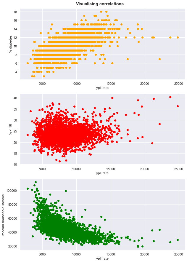
Visualising correlations
import seaborn as sns # another visualisation package for pretty plots
sns.set()
fig = plt.figure(figsize=(10,15)) # create figure object
plt.tight_layout()
fig.suptitle('Visualising correlations', y=0.9, fontweight=1000) # set super title
subplot = fig.add_subplot(3,1,1) # add subplot with 3 rows and 1 column, choose axis 1

subplot.scatter(df['YPLL Rate'], df['%Diabetes'], color='orange') # make scatter plot
subplot.set_xlabel('ypll rate') # set x label
subplot.set_ylabel('% diabetes') # y label

subplot = fig.add_subplot(3,1,2) # choose axis 2
subplot.scatter(df['YPLL Rate'], df['< 18'], color='red') # scatter plot
subplot.set_xlabel('ypll rate')
subplot.set_ylabel('% < 18')


subplot = fig.add_subplot(3,1,3) # choose axis 3
subplot.scatter(df['YPLL Rate'], df['median household income'], color='green') # scatter plot
subplot.set_xlabel('ypll rate')
subplot.set_ylabel('median household income'); # set titlte
visualising other variables vs ypll
plot=[
 'FIPS',
 'Population',
#  '< 18',
 '65 and over',
 'African American',
 'Female',
 'Rural',
#  '%Diabetes',
 'HIV rate',
 'Physical Inactivity',
 'mental health provider rate',
#  'median household income',
 '% high housing costs',
 '% Free lunch',
 '% child Illiteracy',
 '% Drive Alone',
 'YPLL Rate'
] # columns to plot
fig = plt.figure(figsize=(15,35)) # create figure object
# plt.tight_layout()
fig.suptitle('Visualising correlations', y=0.9, fontweight=1000) # set super title

for i in range(len(plot)): # plot target against different attributes

    subplot = fig.add_subplot(len(plot),3,i+1)

    subplot.scatter(df['YPLL Rate'], df[plot[i]], color='green')
    subplot.set_xlabel('ypll rate')
    subplot.set_ylabel(plot[i])
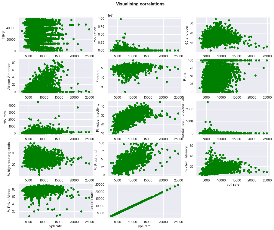
- some variables are not strongly correlated to target or output e.g. FIPS, HIV Rate and population etc
- other variables like diabetes $\&$ % free lunch have a good correlation with the target variable. At this point we may start thinking that free lunch should no longer be on the offer. But perharps there is a factor playing a hideous role?
- you can check the pearson correlation with the target variable in the code output of the next cell.
# correlation matrix
# sort by the top 8 values
cor_matrx=df.corr() # make a correlation matrix using pearson corr.
cor_matrx['YPLL Rate'].sort_values(ascending=False) # view correlations on scale -1 to 1
YPLL Rate                      1.000000
% Free lunch                   0.694590
%Diabetes                      0.662009
Physical Inactivity            0.645538
% child Illiteracy             0.461458
African American               0.436223
Rural                          0.286216
HIV rate                       0.175228
< 18                           0.127011
Female                         0.116916
65 and over                    0.071458
% Drive Alone                  0.031896
FIPS                          -0.062884
% high housing costs          -0.106475
Population                    -0.162204
mental health provider rate   -0.177113
median household income       -0.634813
Name: YPLL Rate, dtype: float64
YPLL vs. % Diabetes regression
# model = OLS # rename model

# define independent and dependent variable
X = df[['%Diabetes']]
y = df['YPLL Rate']
# fit model and predict using OLS (same as LinearRegression)
# show summary
# add bias term

import statsmodels
model = OLS(y, statsmodels.tools.add_constant(X)).fit()
model.summary()
| Dep. Variable: | YPLL Rate | R-squared: | 0.438 |
|---|---|---|---|
| Model: | OLS | Adj. R-squared: | 0.438 |
| Method: | Least Squares | F-statistic: | 2293. |
| Date: | Wed, 21 Aug 2019 | Prob (F-statistic): | 0.00 |
| Time: | 12:50:10 | Log-Likelihood: | -26260. |
| No. Observations: | 2941 | AIC: | 5.252e+04 |
| Df Residuals: | 2939 | BIC: | 5.254e+04 |
| Df Model: | 1 | ||
| Covariance Type: | nonrobust |
| coef | std err | t | P>|t| | [0.025 | 0.975] | |
|---|---|---|---|---|---|---|
| const | 809.4571 | 163.462 | 4.952 | 0.000 | 488.946 | 1129.969 |
| %Diabetes | 767.1553 | 16.021 | 47.884 | 0.000 | 735.742 | 798.569 |
| Omnibus: | 1081.131 | Durbin-Watson: | 1.545 |
|---|---|---|---|
| Prob(Omnibus): | 0.000 | Jarque-Bera (JB): | 7964.973 |
| Skew: | 1.552 | Prob(JB): | 0.00 |
| Kurtosis: | 10.441 | Cond. No. | 50.0 |
Warnings:
[1] Standard Errors assume that the covariance matrix of the errors is correctly specified.
Intepreting the math
-
let’s intepret the data and check the statistical significance to make sure nothing happend by chance and that our regression is meaningful !
-
Prob(F-statistic) is close to 0 which is less than 0.05 or 0.01, so we have significance & thus we can safely intepret the rest of the data !
-
for this model the line of best fit is represented by y = mx + constant or ypll = 767.15 * $\%$ diabetes + 809.45
-
To check how well this line/model performs, the R- squared value of 0.438 is recorded. This means that 43.8$\%$ of the changes in y (YPLL rate) can be predicted by changes in x ($\%$Diabetes)
what does this all mean?
- Simply put, it means that without knowing the YPLL of a community, we can simply collect data about percentage of people affected by diabetes and construct 43.8$\%$ of the YPLL rate behaviour
visualize the model built above
# print cofficients
print(model.params.index)
model.params.values
Index(['const', '%Diabetes'], dtype='object')


array([809.45713922, 767.15527376])
fig = plt.figure(figsize=(10,8))
fig.suptitle('Plot Showing how model fits data', fontweight=1000, y=0.92)
subplot =fig.add_subplot(111)
subplot.scatter(X,y, color='darkblue', label='scatter plot')
subplot.set_xlabel('%Diabetes')
subplot.set_ylabel('YPLL Rate')

# y = mx + c
Y = model.params.values[1] * X['%Diabetes'] + model.params.values[0]
subplot.plot(X['%Diabetes'], Y, color='darkorange', label='models best fit')
subplot.legend(ncol=3);

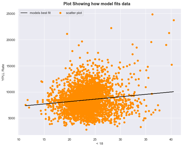
Running the correlations for the < 18 and median household income
YPLL vs.< 18
# Define new X and y
X = df['< 18']
y = df['YPLL Rate']
# fit and show summary
model = OLS(y, statsmodels.tools.add_constant(X)).fit()
model.summary()
| Dep. Variable: | YPLL Rate | R-squared: | 0.016 |
|---|---|---|---|
| Model: | OLS | Adj. R-squared: | 0.016 |
| Method: | Least Squares | F-statistic: | 48.19 |
| Date: | Wed, 21 Aug 2019 | Prob (F-statistic): | 4.74e-12 |
| Time: | 12:50:12 | Log-Likelihood: | -27084. |
| No. Observations: | 2941 | AIC: | 5.417e+04 |
| Df Residuals: | 2939 | BIC: | 5.418e+04 |
| Df Model: | 1 | ||
| Covariance Type: | nonrobust |
| coef | std err | t | P>|t| | [0.025 | 0.975] | |
|---|---|---|---|---|---|---|
| const | 6302.8803 | 315.173 | 19.998 | 0.000 | 5684.899 | 6920.862 |
| < 18 | 91.8513 | 13.232 | 6.942 | 0.000 | 65.907 | 117.796 |
| Omnibus: | 407.946 | Durbin-Watson: | 1.290 |
|---|---|---|---|
| Prob(Omnibus): | 0.000 | Jarque-Bera (JB): | 824.396 |
| Skew: | 0.848 | Prob(JB): | 9.65e-180 |
| Kurtosis: | 4.962 | Cond. No. | 169. |
Warnings:
[1] Standard Errors assume that the covariance matrix of the errors is correctly specified.
- Again, let’s do some sanity checks to make sure results are not random
- Prob(F-statistic) close to 0 which is less than 0.05 or 0.01 , so we have significance
- R squared value not so strong. Only about 1 percent of the changes in y can be explained by the changes in x
Visualising model on this data
fig = plt.figure(figsize=(10,8)) # create figure object
fig.suptitle('Plot Showing how model fits data', fontweight=1000, y=0.92)# set super title and height position
subplot =fig.add_subplot(111) # add a subplot with 1 row and column
subplot.scatter(X,y, color='darkorange', label='scatter plot') # make scatter plot
subplot.set_xlabel('< 18')
subplot.set_ylabel('YPLL Rate')

# y = mx + c
Y = model.params.values[1] * X + model.params.values[0]
subplot.plot(X, Y, color='black', label='models best fit') # plot model line on scatter plot
subplot.legend(ncol=4);
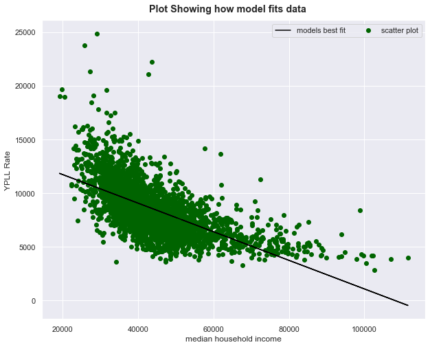
YPLL vs.median household income
# Define new X and y
X = df['median household income']
y = df['YPLL Rate']
model = OLS(y, statsmodels.tools.add_constant(X)).fit() # fit model to data and commute weights and biases
model.summary() # print model summary and view statistics
| Dep. Variable: | YPLL Rate | R-squared: | 0.403 |
|---|---|---|---|
| Model: | OLS | Adj. R-squared: | 0.403 |
| Method: | Least Squares | F-statistic: | 1984. |
| Date: | Wed, 21 Aug 2019 | Prob (F-statistic): | 0.00 |
| Time: | 12:50:14 | Log-Likelihood: | -26349. |
| No. Observations: | 2941 | AIC: | 5.270e+04 |
| Df Residuals: | 2939 | BIC: | 5.271e+04 |
| Df Model: | 1 | ||
| Covariance Type: | nonrobust |
| coef | std err | t | P>|t| | [0.025 | 0.975] | |
|---|---|---|---|---|---|---|
| const | 1.438e+04 | 137.216 | 104.809 | 0.000 | 1.41e+04 | 1.47e+04 |
| median household income | -0.1331 | 0.003 | -44.540 | 0.000 | -0.139 | -0.127 |
| Omnibus: | 697.404 | Durbin-Watson: | 1.377 |
|---|---|---|---|
| Prob(Omnibus): | 0.000 | Jarque-Bera (JB): | 3028.219 |
| Skew: | 1.085 | Prob(JB): | 0.00 |
| Kurtosis: | 7.472 | Cond. No. | 1.81e+05 |
Warnings:
[1] Standard Errors assume that the covariance matrix of the errors is correctly specified.
[2] The condition number is large, 1.81e+05. This might indicate that there are
strong multicollinearity or other numerical problems.
- Prob(F-statistic) close to 0 which is less than 0.05 or 0.01 , so we have significance
- R -squared value is 0.403. This means that 40$\%$ of the changes in YPLL Rate can be explained by the changes in dependent variable x i.e median household income
- median household income is also negatively correlated
what is the meaning of this?
- We can constract 40$\%$ of the information about YPLL Rate by collecting data about median household income.
- Percentage of those below 18 i.e [% < 18] is a weak predictor too, almost no changes are explained by it in x
Visualize this model
fig = plt.figure(figsize=(10,8)) # create figure object
fig.suptitle('Plot Showing how model fits data', fontweight=1000, y=0.92)
subplot =fig.add_subplot(111) # add subplot
subplot.scatter(X,y, color='darkgreen', label='scatter plot') # make scatter plot
subplot.set_xlabel('median household income')
subplot.set_ylabel('YPLL Rate')

# y = mx + c
Y = model.params.values[1] * X + model.params.values[0]
subplot.plot(X, Y, color='black', label='models best fit') # plot model's best fit line
subplot.legend(ncol=4);
Multiple Linear regression
- combining infomation from multiple measures to improve model
# define X and y
cols_to_use =[
#     'FIPS',
#  'Population',
 '<_18',
#  '65_and_over',
#  'African_American',
#  'Female',
#  'Rural',
 '%Diabetes',
 'HIV_rate',
 'Physical_Inactivity',
 'mental_health_provider_rate',
 'median_household_income',
#  '%_high_housing_costs',
 '%_Free_lunch',
 '%_child_Illiteracy',
 '%_Drive_Alone',
#  'YPLL_Rate'
] # these attributes were rigorously run and the irrelevant attributes are commented out as shown

X = df[cols_to_use] # new X or input


y = df['YPLL_Rate'] # output or target variable
model = OLS(y, statsmodels.tools.add_constant(X)).fit() # fit model with data
model.summary() # print model summary
| Dep. Variable: | YPLL_Rate | R-squared: | 0.645 |
|---|---|---|---|
| Model: | OLS | Adj. R-squared: | 0.644 |
| Method: | Least Squares | F-statistic: | 592.0 |
| Date: | Wed, 21 Aug 2019 | Prob (F-statistic): | 0.00 |
| Time: | 15:17:05 | Log-Likelihood: | -25584. |
| No. Observations: | 2941 | AIC: | 5.119e+04 |
| Df Residuals: | 2931 | BIC: | 5.125e+04 |
| Df Model: | 9 | ||
| Covariance Type: | nonrobust |
| coef | std err | t | P>|t| | [0.025 | 0.975] | |
|---|---|---|---|---|---|---|
| const | 4156.5198 | 400.848 | 10.369 | 0.000 | 3370.548 | 4942.491 |
| <_18 | 87.2481 | 9.070 | 9.620 | 0.000 | 69.464 | 105.032 |
| %Diabetes | 328.7789 | 22.331 | 14.723 | 0.000 | 284.992 | 372.566 |
| HIV_rate | 0.9893 | 0.149 | 6.656 | 0.000 | 0.698 | 1.281 |
| Physical_Inactivity | 80.4428 | 8.722 | 9.223 | 0.000 | 63.342 | 97.544 |
| mental_health_provider_rate | -1.1311 | 0.448 | -2.527 | 0.012 | -2.009 | -0.253 |
| median_household_income | -0.0481 | 0.004 | -13.447 | 0.000 | -0.055 | -0.041 |
| %_Free_lunch | 47.3245 | 2.820 | 16.779 | 0.000 | 41.794 | 52.855 |
| %_child_Illiteracy | -43.7611 | 6.407 | -6.830 | 0.000 | -56.324 | -31.198 |
| %_Drive_Alone | -31.4760 | 4.133 | -7.616 | 0.000 | -39.580 | -23.372 |
| Omnibus: | 779.012 | Durbin-Watson: | 1.748 |
|---|---|---|---|
| Prob(Omnibus): | 0.000 | Jarque-Bera (JB): | 4556.589 |
| Skew: | 1.125 | Prob(JB): | 0.00 |
| Kurtosis: | 8.668 | Cond. No. | 6.86e+05 |
Warnings:
[1] Standard Errors assume that the covariance matrix of the errors is correctly specified.
[2] The condition number is large, 6.86e+05. This might indicate that there are
strong multicollinearity or other numerical problems.
-
Analysis
- free lunch is strongly correlated to YPLL rate
- should we eliminate free lunch to improve life and reduce YPLL Rate?
- or peharps there is a third variable connecting everything that policy makers should look into?
Looking at Non-linearity..
- linear regression only helps us come up with the best fit line for our data
- But there are cases of weak interaction between variables (non-linearity)
- let’s try fitting with a polynomial fit using sklearn
from sklearn.preprocessing import PolynomialFeatures # helps us fit polynomials to our data for best fit
poly_transform = PolynomialFeatures(degree=3) # import polynomial feat and instantiate

X_ply = poly_transform.fit_transform(X) # fit and transform input
model = OLS(y, statsmodels.tools.add_constant(X_ply)).fit() # fit model to data
print('R-squared value: {:.2f}'.format(model.rsquared)) # print R squared values
print('Adjusted R-squared value: {:.2f}'.format(model.rsquared_adj))
R-squared value: 0.76
Adjusted R-squared value: 0.74
conclusion
- The initial Adj R squared value of .64 has been improved upon greatly using the polynomial features method.
- The new R squared values are 0.76 and 0.74 for the adjusted!
- Note: Train test split procedure was not used
- To be done in a future notebook using the same data with metrics!
- This was an illustration of how to back a model from a statistical point of view..